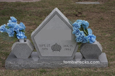
This wreck is so awesome, it has received numerous awards*:
1. Award for Nerdiest Tombstone
2. Award for Biggest Logo Fail
Please compare to the real one below. Dead Trekkies everywhere will be spinning in their graves (HAHAHAHAHAHAHA!!).

3. Award for Best Irony
If this guy intended to Live Long and Prosper, well, he did not.
*totally fictitious ones
UPDATE:
Many of you have left me comments stating this logo is actually the Next Generation logo, and therefore this is not a "fail" after all. Here it is:

The arch in the logo on the tombstone is centered, and the correct logo is, well, not. I still vote fail, but I am arguably picky since I happen to do graphic design.
Thanks for the info Trekkies! :o)

It was revenge (the tombstone maker liked Star Wars) because revenge is a dish best served, well, you know...
ReplyDeletei'm sure the 16 year old's parents didn't know any better...but kudos for them not putting cheesy baseballs or puppies on his (maybe her) grave :)
ReplyDeleteIt's a Next Gen logo on the tombstone, not a TOS logo, so they did actually get it right. -_-
ReplyDeletehttp://images2.fanpop.com/images/photos/3900000/Logo-star-trek-the-next-generation-3983227-800-600.jpg
Next Gen logo, not Original Series. This is not a logo fail at all.
ReplyDeleteThe stone looks more like a Krell doorway, which would be paying homage to Forbidden Planet, takes the fail to the next generation; back
ReplyDeleteI was born in 1978, and was in the height of my Star Trek phase in 1994. This is probably my alternate universe tombstone.
ReplyDeleteAny trekkie seeing this would immediately know what they meant. I don't see this as a fail at all.
ReplyDeleteDon't worry; this still has an element of fail to it. The logo is clearly centered while any good Trekkie would know that the Next Gen logo is asymmetrical.
ReplyDelete